how nba changes?
(PRINTED INFOGRAPHIC & ONLINE DATA VISUALIZATION)
Intro
2017 Nov | 6 Weeks Personal Project
Goal
I want to demonstrate how NBA changes via comparisons of yearly average height by position and the yearly MVP. I used two different forms to convey this goal, which are printed infographic and online data visualization. Due to the aesthetic, user experience, and characteristic, the visual outcome of these two forms have been produced in slightly different way.
phase
1. Data Collecting | Finding information to construct the content of the data visualization.
2. Infographic | Organizing information into visual layout
3. Researching | Collecting inspirations of scrolling data visualization
4. UX&UI | Creating wireframe & user interface
5. Motion Graphics | Producing the motion graphics to demonstrate the detailed interaction
Data
collecting
NBA MVP Award Winner In NBA History at www.basketball-reference.com
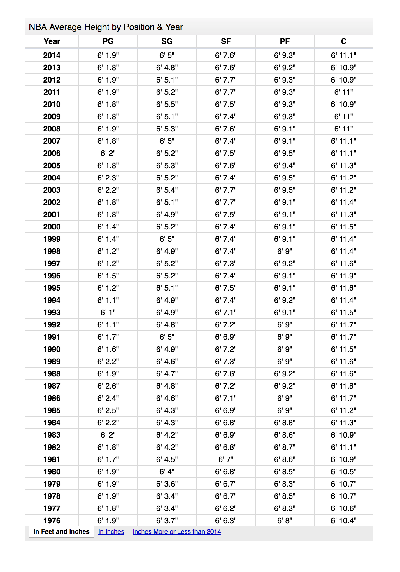
NBA Average Height by Position & Year from www.basketball-reference.com
Design questions
Is there any pattern of MVP distribution in NBA history?
Is there any relationship between the pattern of MVP distribution and the change of average position height?
Is that possible to reveal the game styles change in the NBA through the visulization?
infographic
Overview
Size: 25' x 68'


Data
VisUALIZATION
PRECEDENTS RESEARCH
How Americans Die - Bloomberg visual data
Parallel coordinates graphs reveal how groups show similar or different profiles across many quantitative variables. It also align the style with the infographic.
THE MOST TIMELESS SONGS OF ALL-TIME - The Pudding
Using dots to represent different profiles can work with parallel coordinates graphs seamlessly.


